

Contrast is the juxtaposition of two or more colours in a way that allows them to be effectively compared. Johannes Itten was responsible for the development of successful methods of creating and classifying different types of contrast. The extent of the contrast depends on how much colours differ from each other: the greater the difference the greater the contrast. High contrast combinations include black/white, warm/cool and large/small.
Contrast of Colour
Contrast of colour is a relatively simple process. Using the colour wheel to determine a set of pure complementary colours or triadic colours immediately creates bold and vigorous contrasts.
When a contrasting combination is right, it is harmonic and balanced. As the intensity of the contrasting colours are reduced, such as monochromatic colours, the vigour and contrast of the combination is also reduced.

Contrast of Value
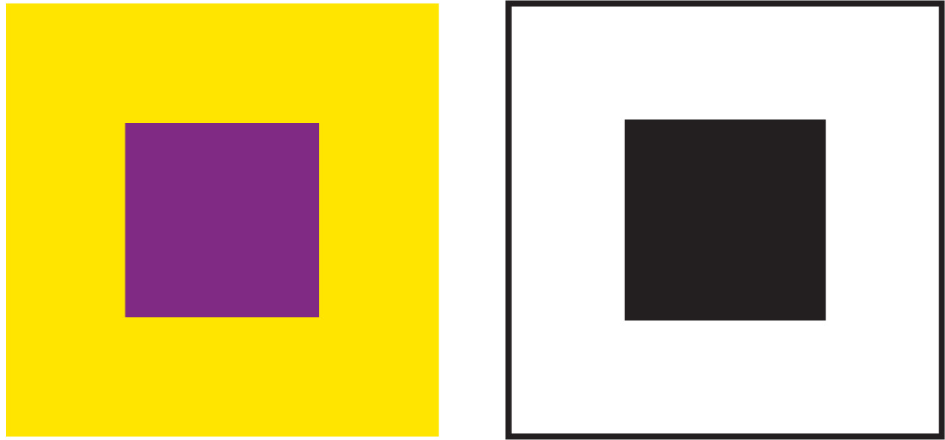
Contrast of value is the balance between lightness and darkness in juxtaposed areas. The colour with the darker value is seen as heavier and will not require the same amount of area as the lighter colour, in order to create balance. The surrounding background or environment can create further contrast and determine how the colours are perceived.


Contrast of Saturation
Contrast of saturation is the balance between the purity of colour and the neutrality of two juxtaposed colours. The purest colour will reflect more light and be visually brighter, and therefore not require the same amount of area as the less saturated colour in order to create balance.
-02.png)
-03.png)
Contrast of Proportion
Contrast of proportion is the contrast between the size of allocated areas, such as small and large, short and long, thick and thin. The allocated area with the largest proportional space is the dominant area; the smaller spaces are subdominant areas and become accent colours.
-02.png)
-01.2.png)

